
Last fall, I found myself in the strange but fortunate situation of working on two DVD packages for Criterion simultaneously. One of these, Andrei Tarkovsky's SOLARIS, allowed for a long, free-formed process of experimenting and exploration, while the other, Jonathan Demme's SOMETHING WILD, came with a more specific brief. But it ended up being a perfect example of how a simple concept can sometimes be the toughest to execute.
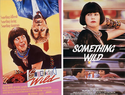
original Something Wild posters
After re-watching the movie, which my good friend Jason introduced me to when we were college roommates, I couldn't resist coming right out of the gate with this Melanie Griffith cover with amped-up 80's pastels:
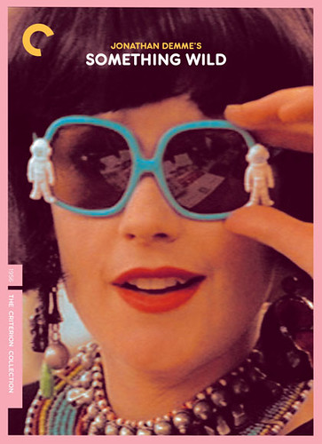
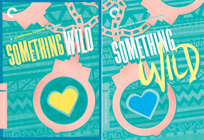
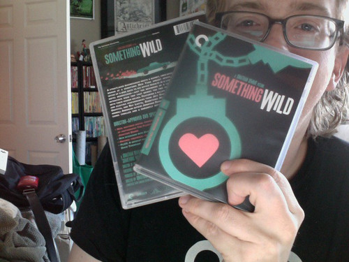
I was quickly informed that due to contractual obligations, if we were to feature one of the two leads on the cover, we'd have to feature the other (in this case, the great Jeff Daniels) in equal measure. And as much as I was enamored with Griffith's Lulu (as any fan of this movie would be), I knew that this cover should probably try to get under the surface a little more. My art director Sarah challenged me to the assignment of coming up with something featuring an icon or object from the film, avoiding its lead characters completely. We immediately thought of handcuffs, a symbolically-charged prop from two of the movie's most memorable and disparate scenes. I mocked up a cut-out pair of cuffs and, caution to the wind, threw in a heart locked up inside. Cheesiness be damned, the heart could be a perfect and playful indicator that this was a romance and not a cop movie, plus it seemed to work pretty well thematically for a movie whose characters are emotionally locked and chained to one another. Sounds easy enough, but without even realizing it, I soon found myself stuck on autopilot in an 80's Lulu-landscape of color.

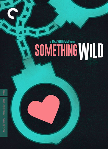
These may have been good covers back when the film was originally released, or covers that Lulu herself would have liked. But I needed steering back into the 21st century to re-brand the movie in some way and stay as far away from the visual palettes and cliches of the 80's as possible. It was a case of not seeing the forest for the trees... the very 80's trees. So, keeping the handcuffs and scrapping the rest of the mess I'd made, I started from scratch and asked myself what would be the simplest, most stripped-down graphic I could get away with, looking to Romek Marber's iconic Penguin Crime book covers for inspiration. Presenting Something Wild as romantic-comedy-meets-film-noir was our new goal, and I wanted to convey that dark side, the unique tone shifts that Demme brings into the movie and balances so well. So, starting with stark black and keeping the aquas, pinks and blues as accent colors, I kept it simple and the results felt much better...
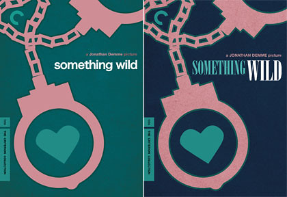
I swapped around the colors and tweaked the title treatment to add a little bit of fun back in, and we had our final cover. It was great to be able to go with such a minimalist concept and hopefully it captures the tone and spirit of the movie at the same time. I have new respect for the great poster artists who excel at creating iconic images using no people, stars, characters whatsoever... it's hard! The final cover:

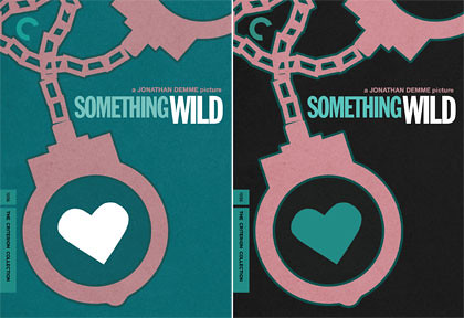
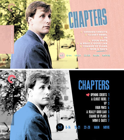
Of course, after deciding to re-style the cover, I had to do the same with my plans for the rest of the package. Seen here are a couple of menus before and after we scrapped the 80's vibe.
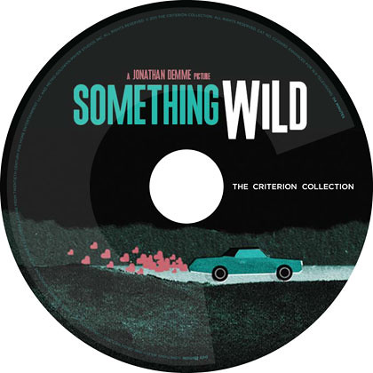
Lastly, here's the Blu-ray disc art, an illustration which also appears on the back of the standard DVD case. I thought it would be neat to illustrate other things and moments from the movie throughout the package in the same style as the cover, but ultimately ended up with just this, leaving plenty of room in the menus and booklet for some great photos and stills.
A fun challenge for a really fun movie that I'm so happy to have worked on, made by a director I have a tremendous amount of respect and love for. Something Wild is out on DVD and Blu-ray from The Criterion Collection on May 12th.
7 comments:
Thanks for sharing your thought process. It was very interesting to see the evolution of the art. I especially love the car graphic on the disc!
Hi Sam, love the blog, especially the process posts. It’s a damn shame you couldn’t use the Melanie Griffith cover for Something Wild - it’s a stunner. What are the chances of making this version available online as an alternate, like you so kindly did with your Never Let Me Go design? I’m sure your fans would be mighty appreciative!
Thanks Anonymous - yes, I've uploaded that image and others to my Flickr page to view/download, if that's what you mean. Here's the link...
http://www.flickr.com/photos/samsmyth/5662051000/in/photostream
Thanks for the reply. I actually meant a full alternate blu ray wrap, like you did with Never Let Me Go. It's such a cool design it would be great to be able to see it 'alive' on a shelf.
Ah gotcha. I'm sticking by the actual cover on this one as I like it more myself, but feel free to mock up your own alternate wrap.. :)
Oh! I like the orange one too!
Great job on this cover/menus, Sam! One of the very best recent graphic treatments from Criterion in recent memory. The original '80s look is great, but you brought all the requisite noirish menace in the final look.
Post a Comment